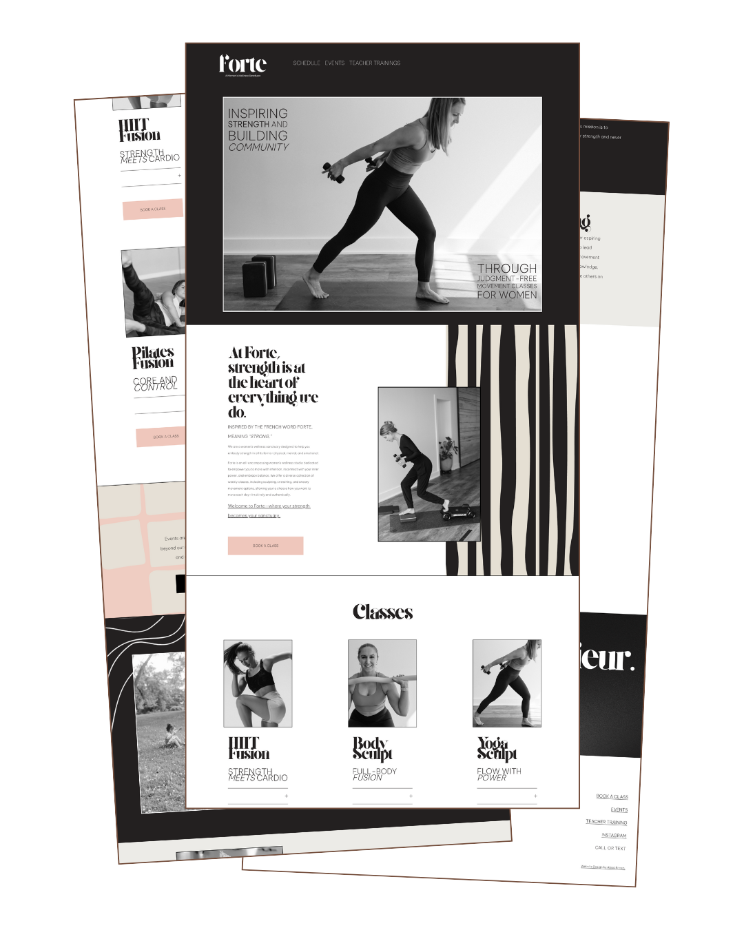
forte
Branding + custom website
Location: Lakewood, Ohio
Industry: Women’s wellness sanctuary (sister brand to Yoga Strong)
Services: Branding, simple website, social media templates
Brand Feel: Minimal, strong, and feminine. A refined simplicity with a quiet strength.
Color Direction: White, black, blush, cream, and soft gray. Black-and-white imagery to enhance contrast and sophistication.
Notes: The name “Forte,” meaning “strength” in French, inspired a visual identity that feels equally delicate and powerful anchored in clarity and calm.